/ Projects
SPA AND GYM – HOLIDAY INN ANDORRA
When we think of a spa, the first thing that comes to mind is a classic and sophisticated design, dominated by a neutral and simple ambience. The colours are usually based on a monochromatic light scale and neutral colours and the lighting is soft and somewhat dark.
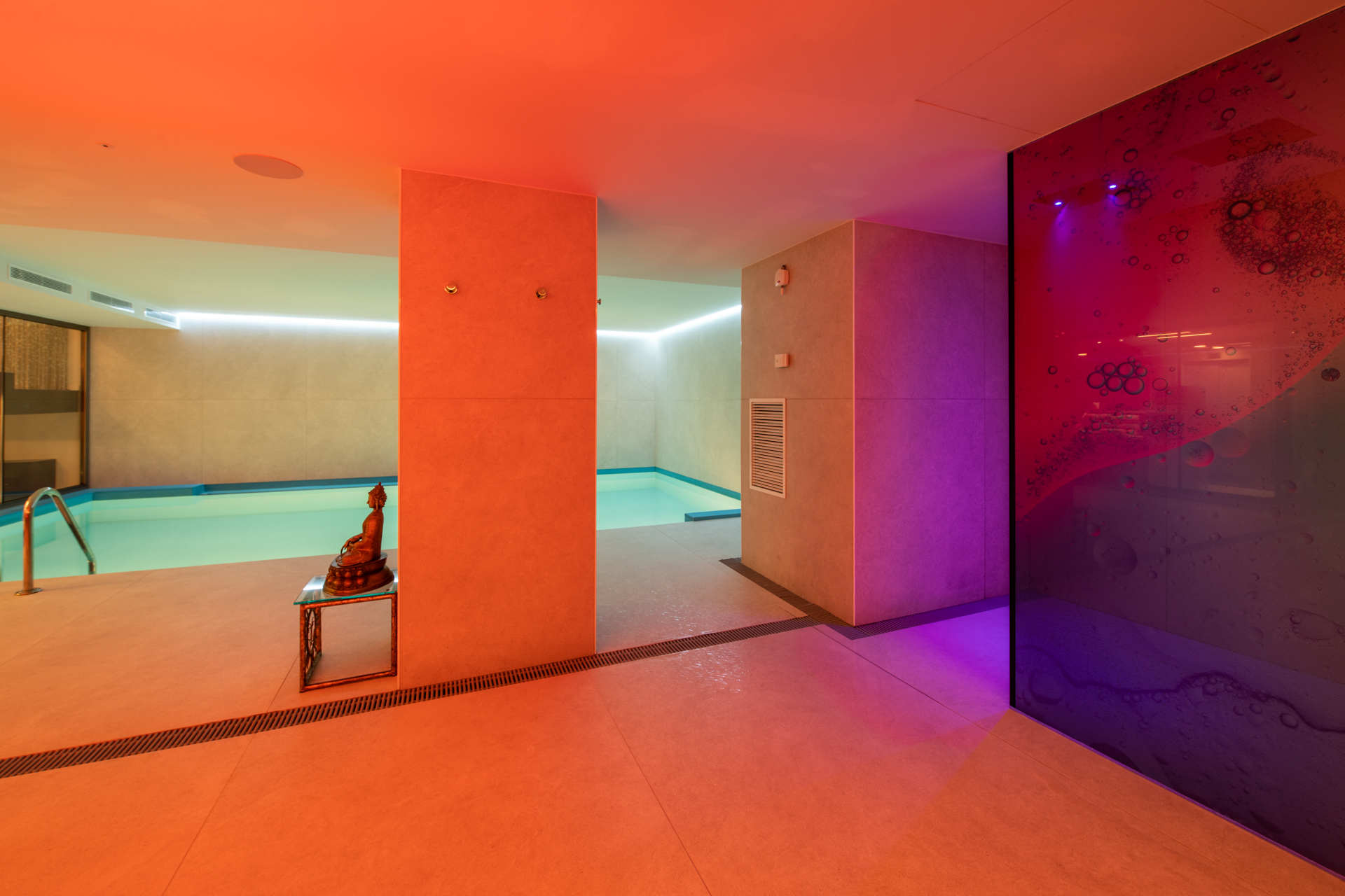
However, when we were chosen for this project, we did not hesitate to break the traditional schemes to provide a new and completely renovated style. As we had a large space, and with relaxation and enjoyment as our main objectives, we filled the space with light and life by combining warm and cold tones simultaneously.
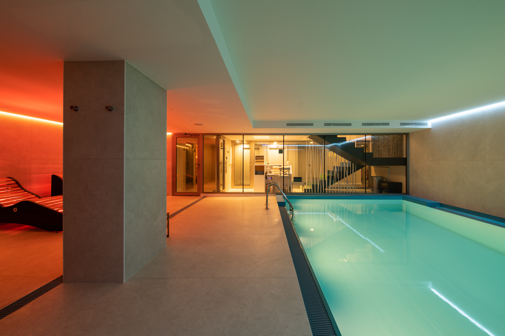
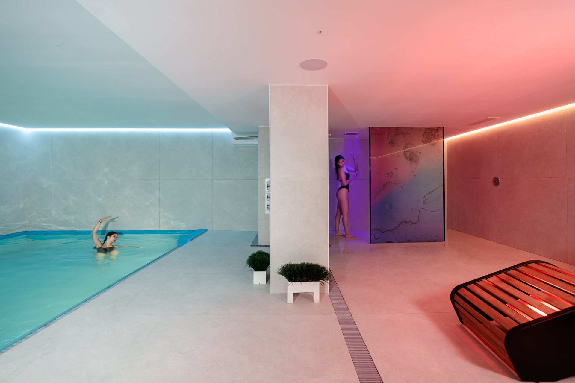
A white and intense light prevails in the area of the indoor swimming and combined with the predominant colours of white and blue it brings freshness and spontaneity. White represents peace and light, and as a colour it does not overwhelm but rather transmits a sense of freedom. Blue, for its part, represents stability and calm.
In contrast, we wanted to differentiate the second zone as an area for relaxation and here we played with warm colours. This warmth reminds us of the warmth of a hearth and the calm it brings but taken to the highest level of expression. We chose a series of reds and oranges as the predominant colours as these tones bring a lot of strength and energy, which remind us of fire, thus reinforcing the idea of warmth.
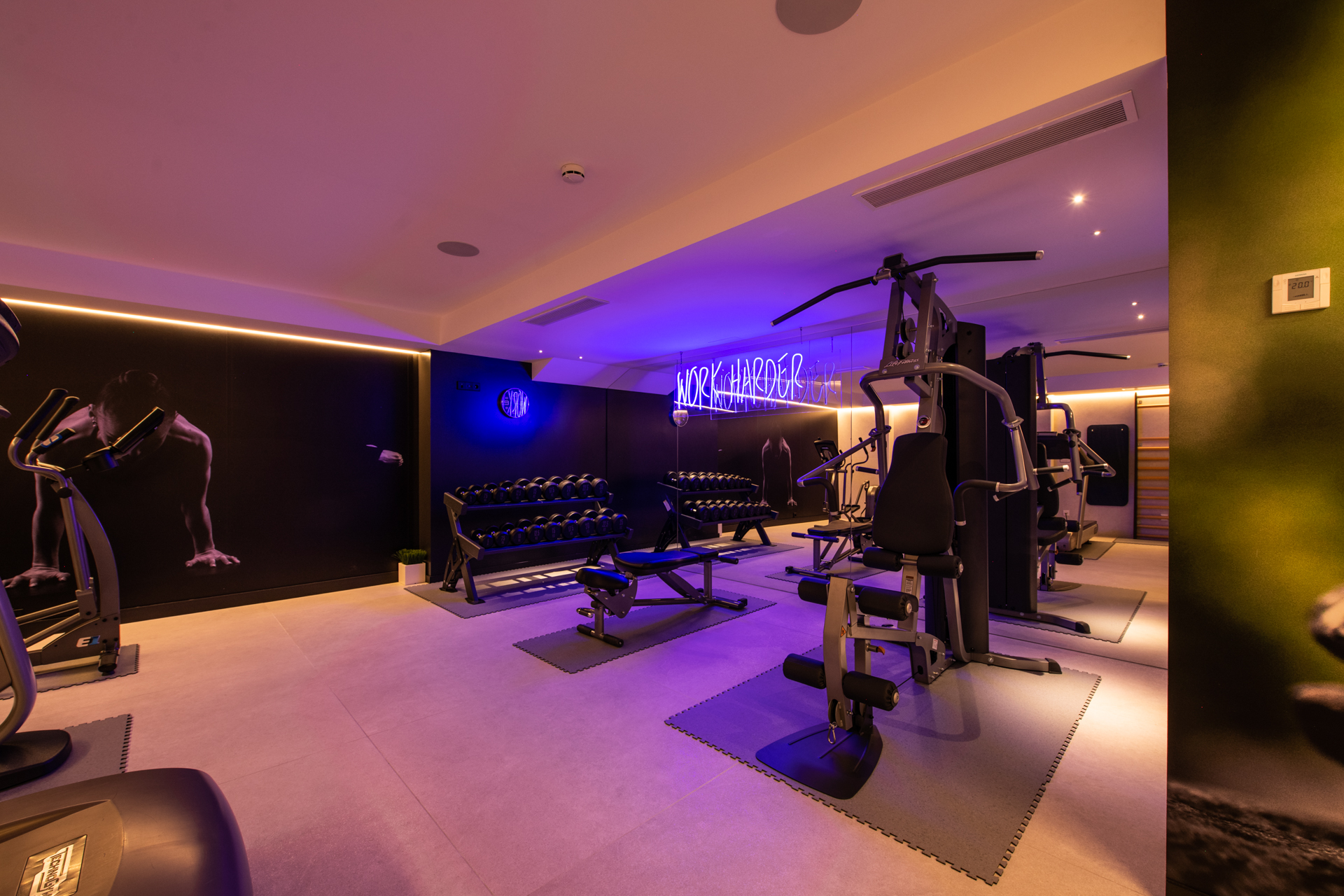
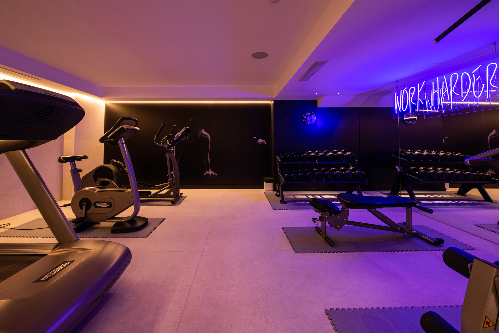
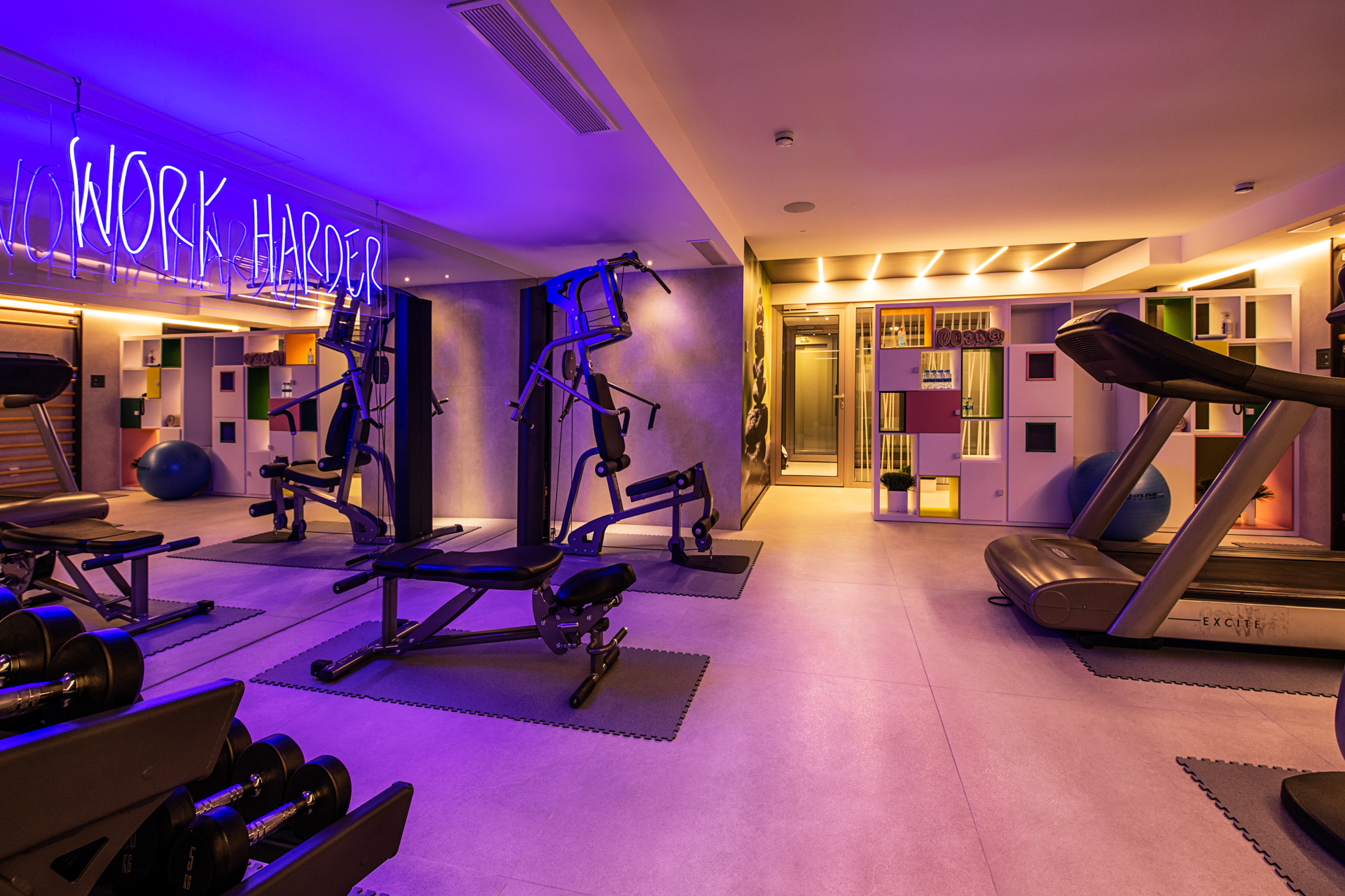
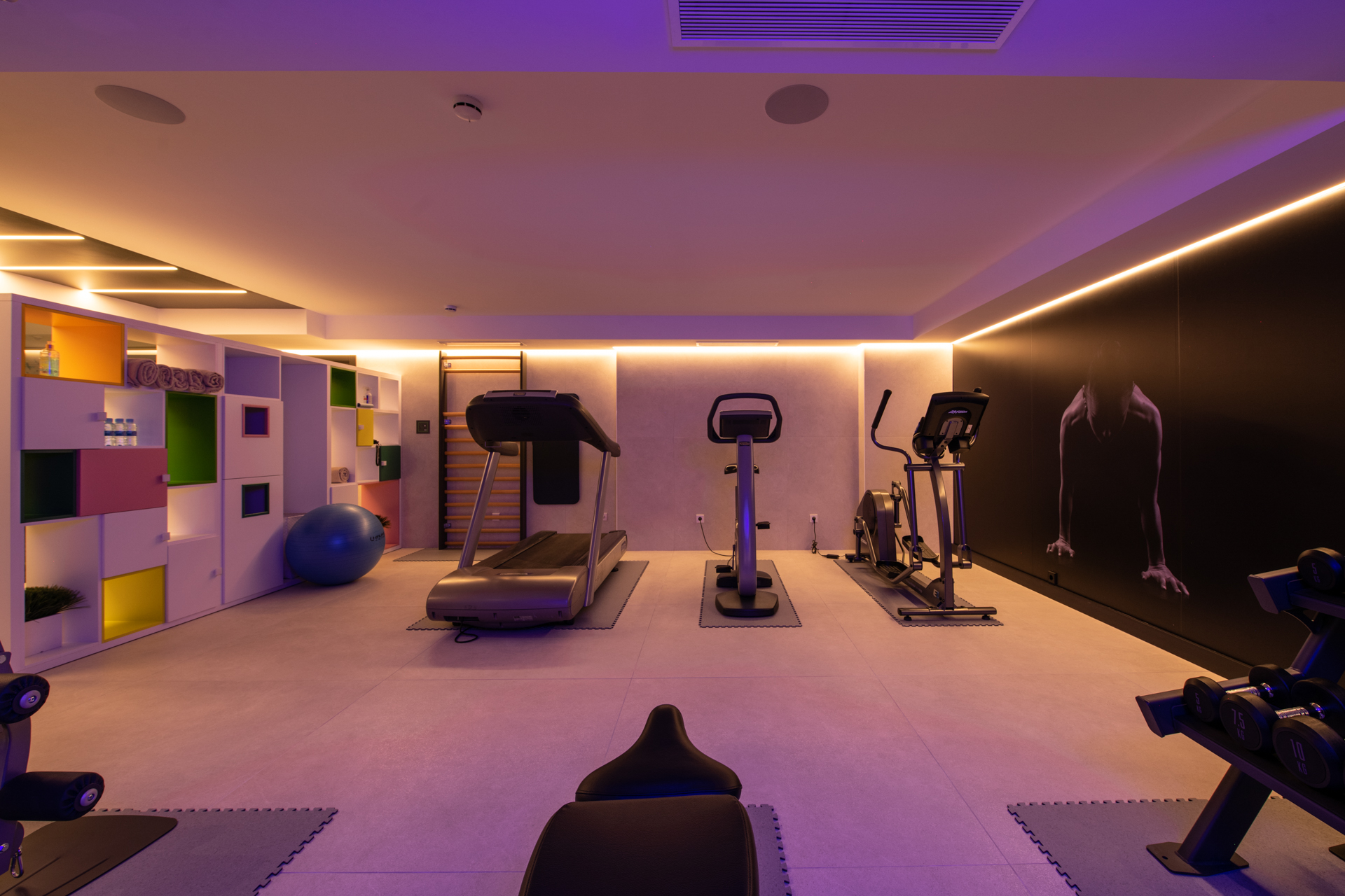
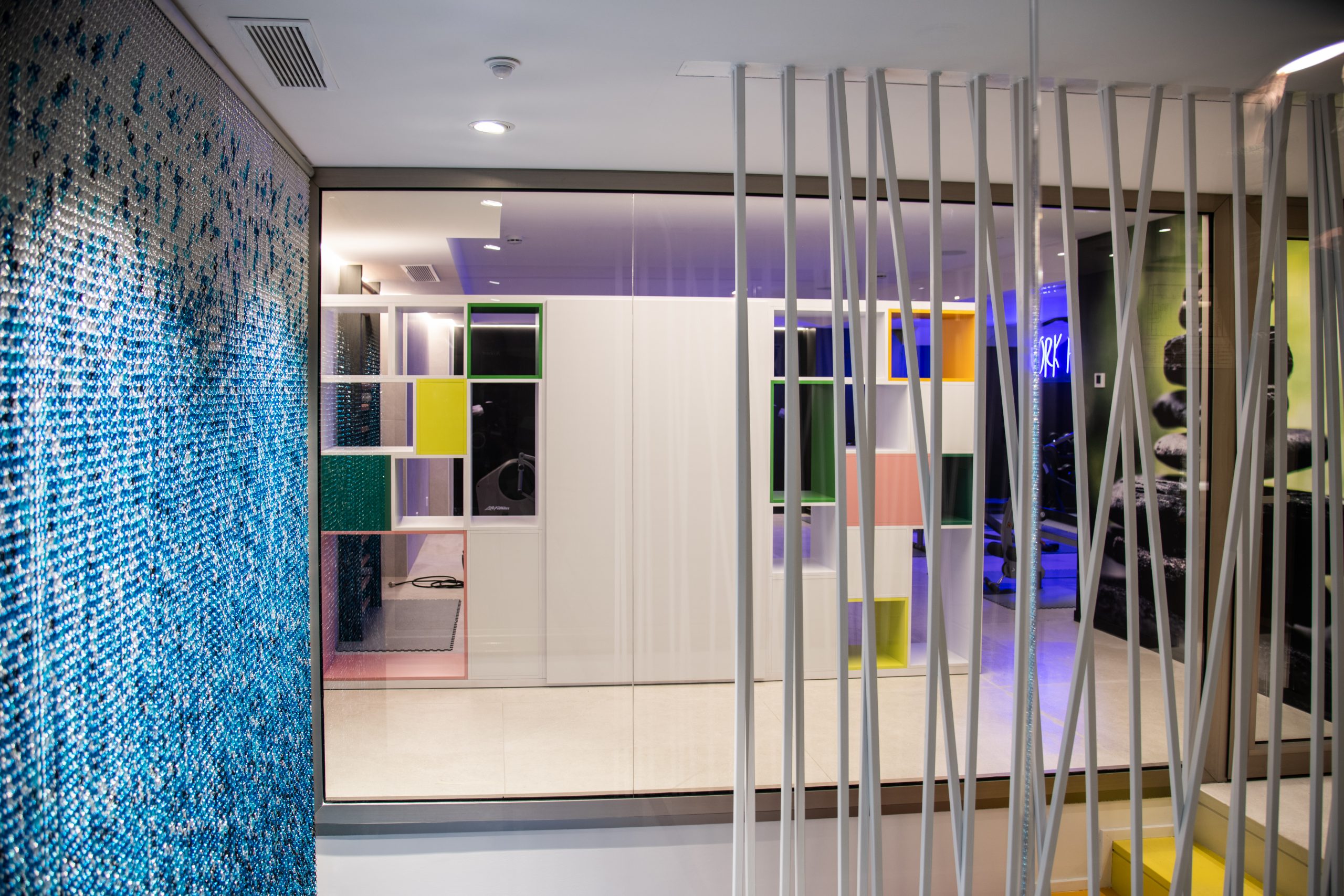
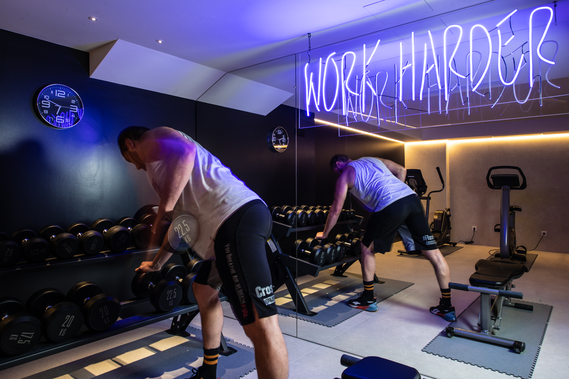
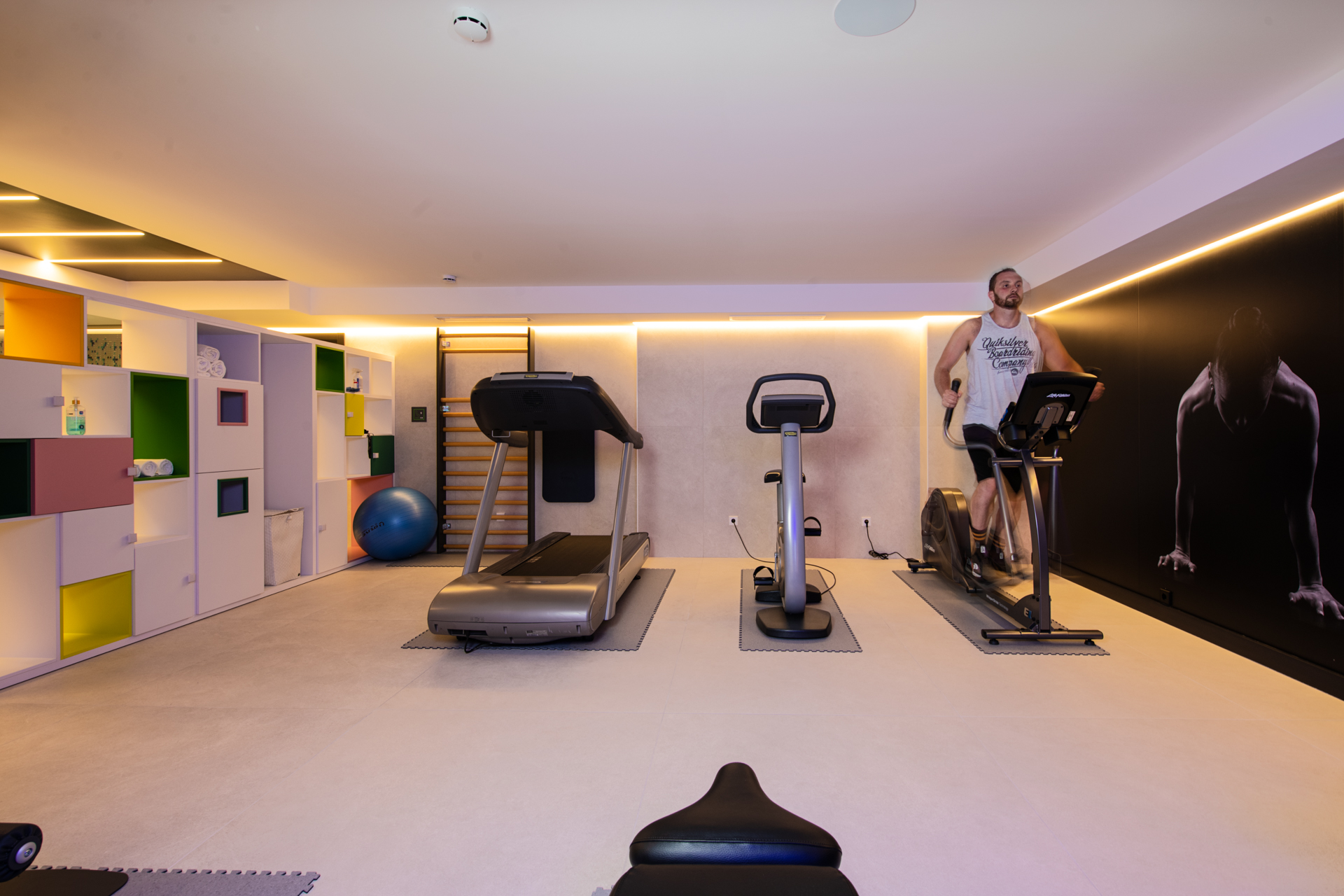
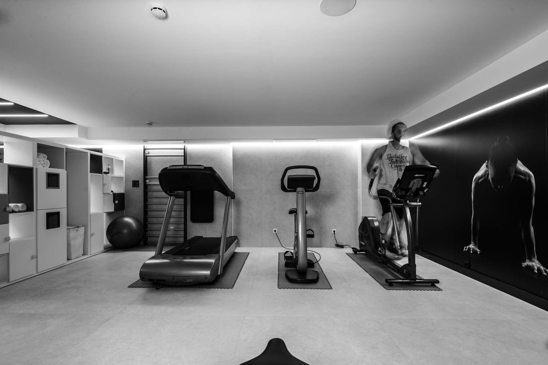
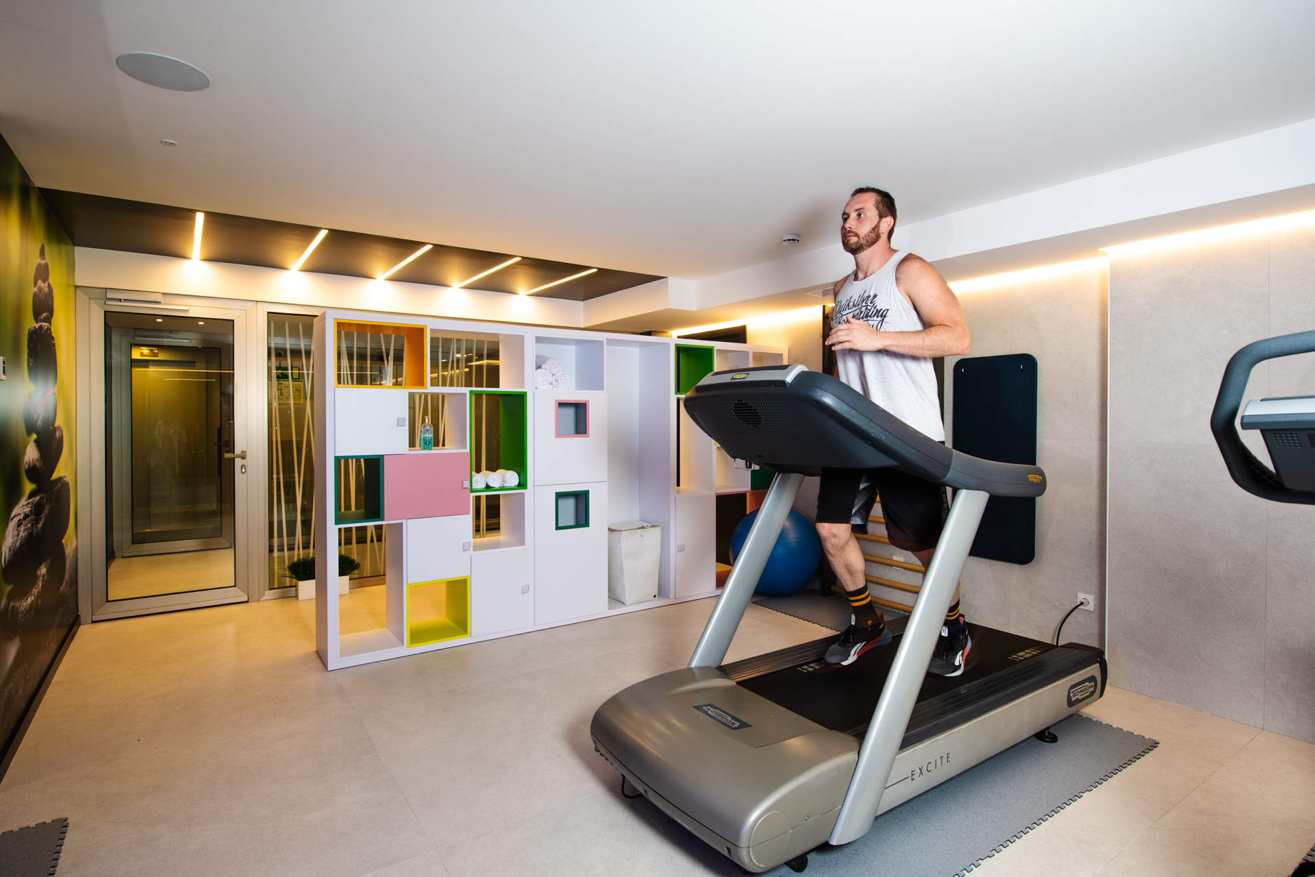
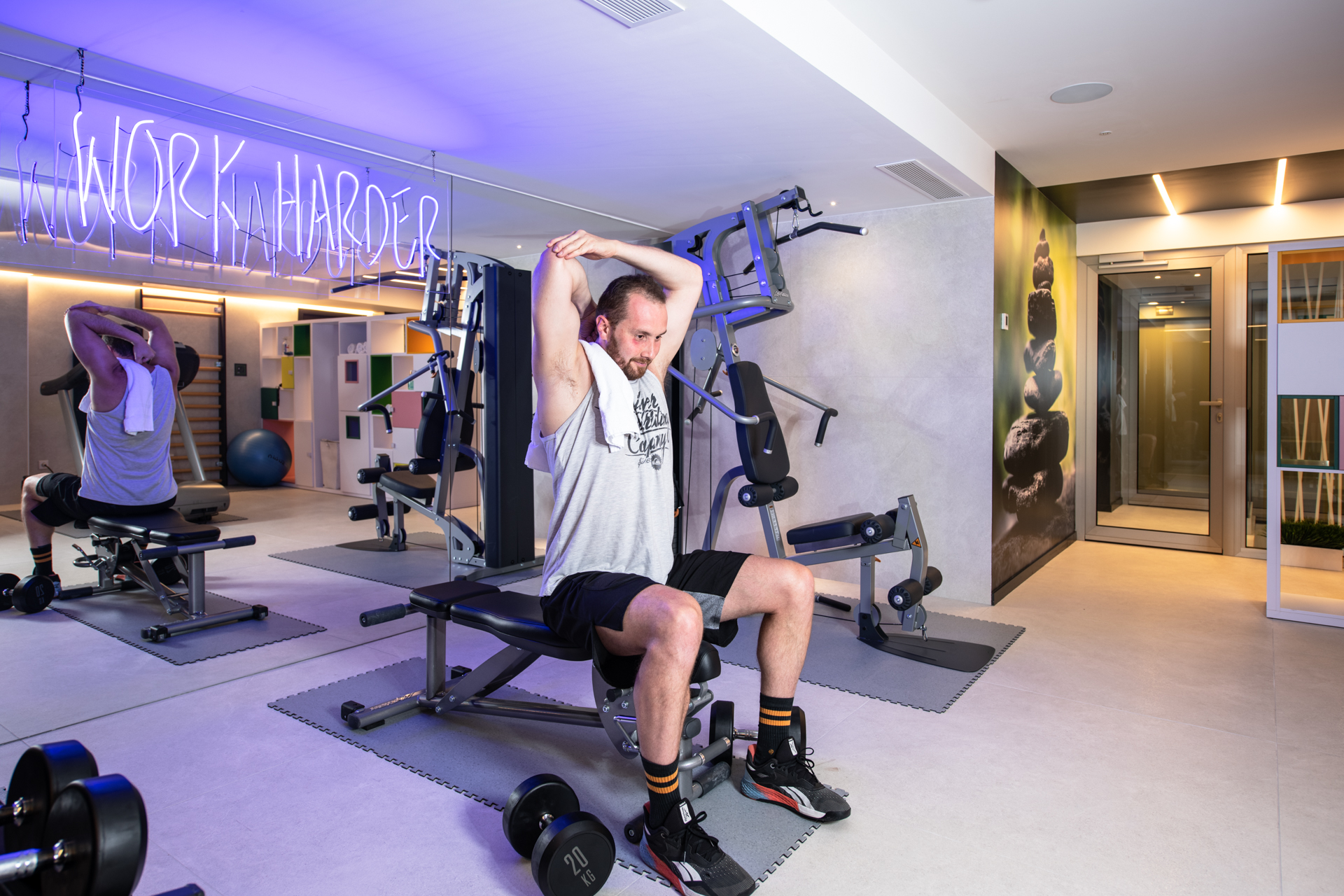
On the other hand, gyms are places that are full of energy and colour, where we are active and where we feel the adrenaline. Since machines are what they are and have a function, we felt this was the right place to play with the lighting and all that it can transmit to us.
In our design we wanted to continue along the same lines as the spa area with combinations of colours and a light that brings energy and motivation, and for this reason we chose neon. Sport is a time when we connect with our body and disconnect from everything else. We also installed a neon panel traced with fine lines, which generates contrast and brings a touch of energy to the ambience.
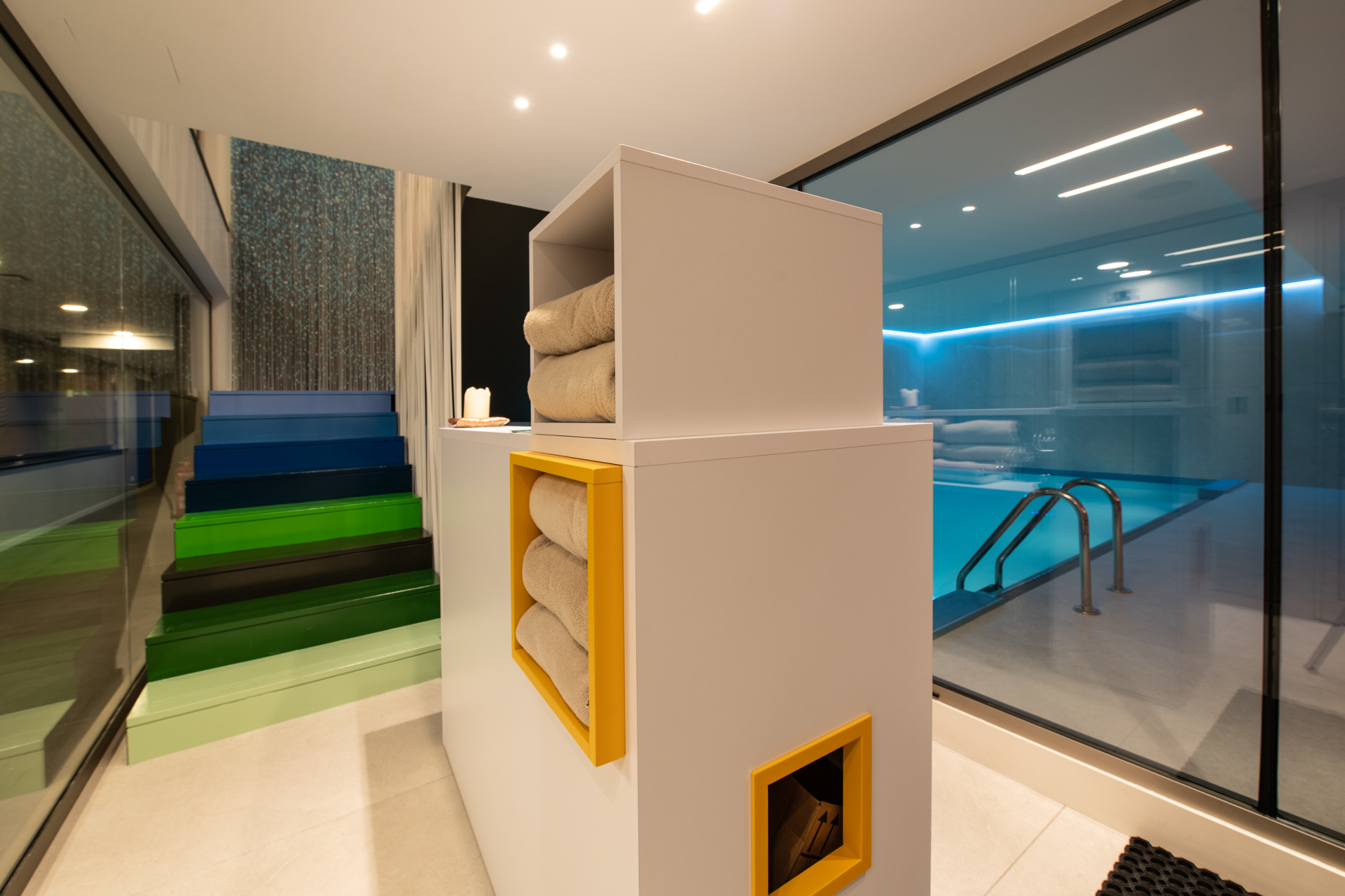
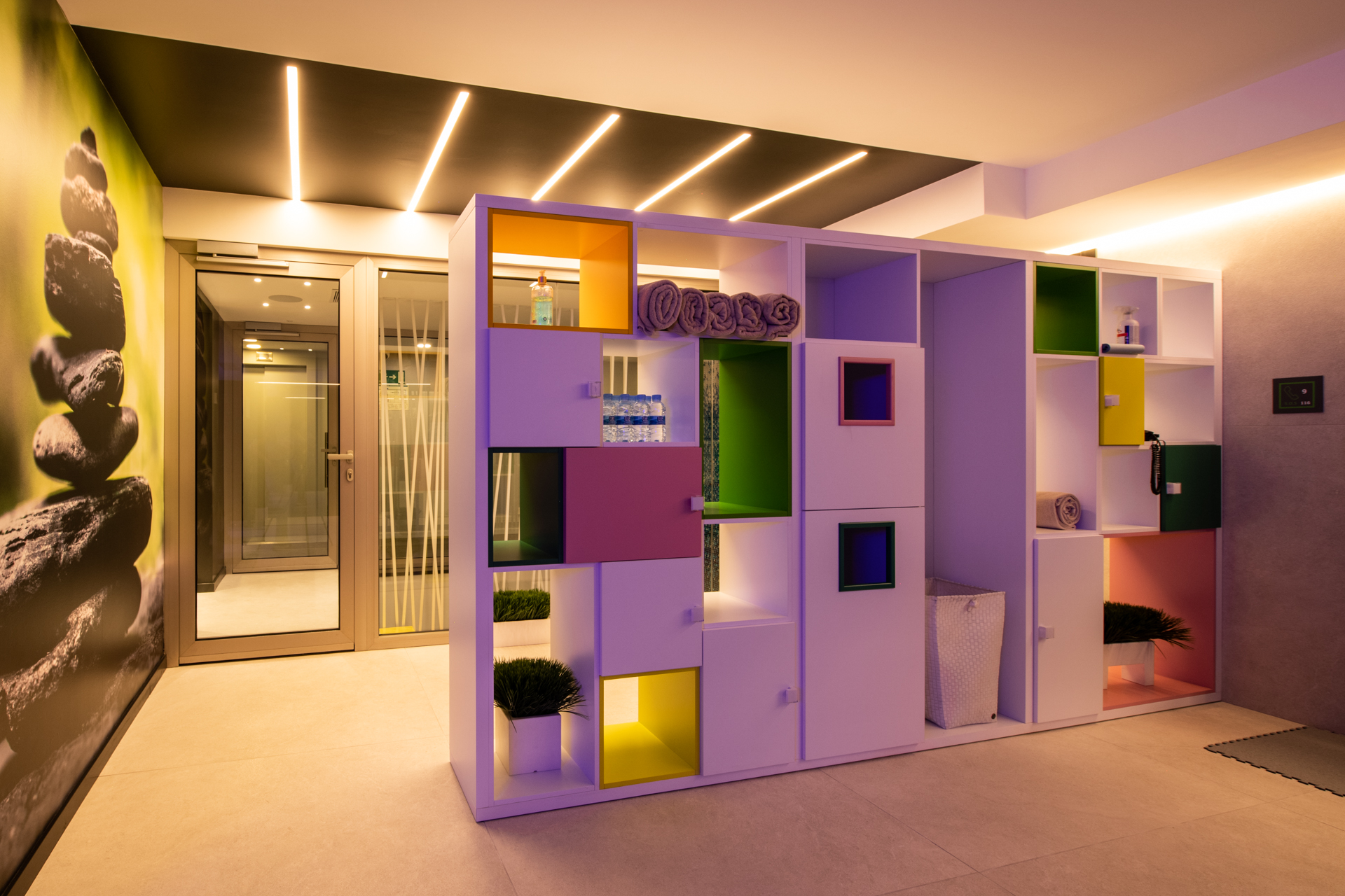
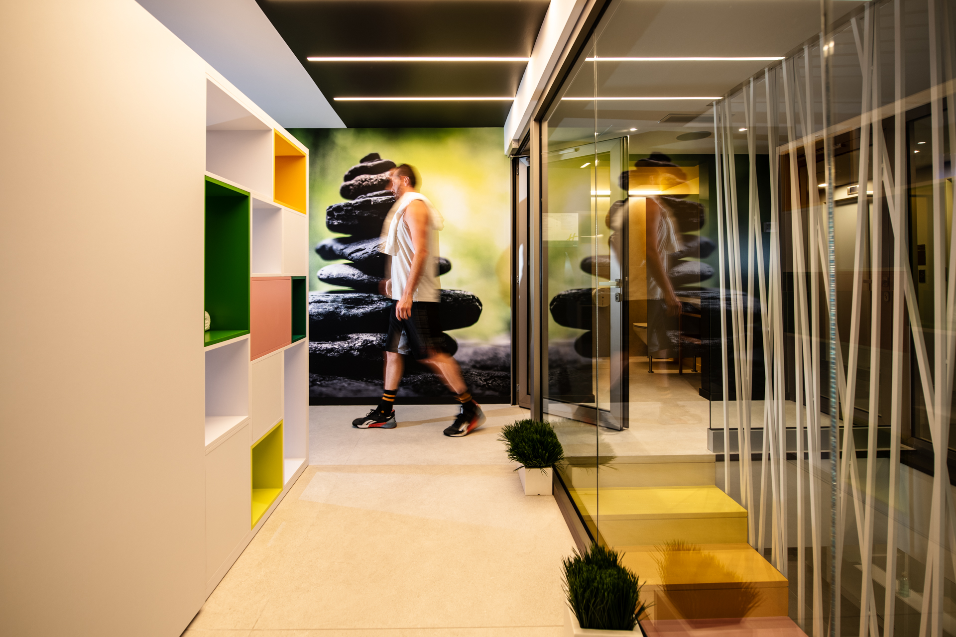
In the overall design of this project, we played a lot with the nuances of cold and warm colours in order to separate and get maximum benefit from each space.